|
Psychologist
Reference:
Griber Y.A., Tsygankova K.Y., Ustimenko Y.A.
Color as a Trigger: the Effect of Chromatic Characteristics of Touch Buttons on the Motivation
// Psychologist.
2022. ą 6.
P. 73-87.
DOI: 10.25136/2409-8701.2022.6.39497 EDN: TGRQQV URL: https://en.nbpublish.com/library_read_article.php?id=39497
Color as a Trigger: the Effect of Chromatic Characteristics of Touch Buttons on the Motivation
Griber Yuliya Alexandrovna
Doctor of Cultural Studies
Professor, Director of Color Laboratory at Smolensk State University
214000, Russia, Smolensk region, Smolensk, Przhevalskogo str., 4

|
y.griber@gmail.com
|
|
 |
Other publications by this author
|
|
Tsygankova Karina Yurevna
Researcher at the Color Laboratory of Smolensk State University
214000, Russia, Smolensk region, Smolensk, Przhevalskogo str., 4
|
|
kayasmolensk@gmail.com
|
|
 |
|
Ustimenko Yuliya Aleksandrovna
PhD in Pedagogy
Head of the Department of Design, Smolensk State University
214000, Russia, Smolensk region, Smolensk, Przhevalskogo str., 4
|
|
ustimenkoya@mail.ru
|
|
 |
Other publications by this author
|
|
|
DOI: 10.25136/2409-8701.2022.6.39497
EDN: TGRQQV
Received:
23-12-2022
Published:
30-12-2022
Abstract:
The object of the study is modern smartphone users, the subject is the influence of chromatic characteristics of touch buttons on the motivation. The purpose of the study was to experimentally test the hypothesis that various chromatic characteristics of buttons that a person sees on a touch screen (their brightness, tone, saturation) can act as visual triggers and have a noticeable effect on the motivation to touch them. The experiment involved 48 people with normal color vision (24 men and 24 women) aged 19 to 21 years. The color stimuli of the experiment were developed on the basis of the PCCS color system (Practical Color Coordinate System) and included 52 shades. The analysis evaluated the frequency of occurrence of (1) individual colors; (2) groups of colors; (3) colors of a certain tone; (4) the probability of choosing a certain color out of two. The frequency of occurrence was assessed using procedures and methods of visual statistics. To estimate the probability of choosing a certain shade from two, the method of associative rules was used. The analysis showed that the most motivating are the shades with high saturation of four tones – bright blue and yellow, green and red colors. Women are more motivated by red and red-purple shades, men – by yellow, orange, green and green-blue. At the same time, the strategy of choosing one shade out of two in a pair is more predictable for women than for men. The obtained data have a wide application potential. They can be used in the design of websites, web applications, interactive educational materials, as well as training programs for users with different socio-demographic characteristics.
Keywords:
color, color perception, color cognition, motivation, tactile sensation, touch, visual trigger, experiment, association rule, PCCS color system
This article is automatically translated.
You can find original text of the article here.
IntroductionA familiar element of human interaction in modern society are smartphones – (from the English smartphone – smart phone) mobile phones supplemented with the functions of a personal computer. According to statistics, the number of smartphone users in the world already exceeds 6 billion and increases by several hundred million annually [1]. People use smartphones to chat with friends, listen to music, browse social networks and read the news. Half of the owners describe their smartphone as something they "cannot live without" because, in addition to the obvious functional advantages, they receive emotional benefits from it – in particular, a sense of psychological comfort, a subjective sense of privacy, stress relief and tactile satisfaction [2]. As a rule, smartphones are manufactured with touch screens, which over the past decades have become an integral part of visual communication. The use of touch screens provides a quick response to user actions and makes it easier to perform many tasks. For example, they help to easily view the contents of the application using the scroll function, quickly switch between screens, easily select the necessary options using touch buttons. For the convenience of the user, various colors are used when developing buttons, which help to make the interface intuitive, provide quick navigation through the main sections of the application and significantly simplify interaction with the program. However, recently, due to the growing interest in multisensory experience (see, for example: [3-6]) and design strategies based on evidence and scientific evidence (Eng. evidence-based design – evidence-based, scientific design), the emphasis in color selection has begun to shift noticeably from its exclusively aesthetic and functional characteristics [see sub-section: [7]). Of particular importance in modern industrial design is the understanding of the influence of color on cognitive processes, primarily on interpretation and motivation (see appendix: [8]). According to the available data, among the five human senses, touch and sight dominate in our knowledge of the things of the surrounding world. Through touch, we can get information about texture and hardness, temperature and weight (see sub-section: [9]). However, in most cases we limit ourselves to visual observation only. To use tactile sensations and touch an object, motivation is needed, which, on the one hand, depends on the personal qualities of the subject of perception (see, for example: [10; 11]), and on the other – on the specific properties of the object (its shape, size, texture (see, for example: [12]) and the conditions in which all this happens [13; 14]. The experiments conducted convince us that some visual qualities stimulate the motivation to touch an object that possesses these qualities to a much greater extent than others. In modern studies of motivation, such qualities are designated by the term "trigger" (from the English trigger – trigger mechanism), which is used in a broad sense, denoting any cause of action; a stimulus that "triggers" a certain behavioral reaction (see, for example: [15]). For example, one of the strong visual triggers of touch is a special wool-like structure of the material; on the contrary, the texture of cotton practically does not cause a desire to touch. Natural materials (wood or ceramics) motivate more than artificial ones (plastic or glass). Rounded shapes (circle, ball) – stronger than angular (triangle, cube, square). Small objects are more likely to attract than large ones (see subsp.: [16]). The motivation to touch is closely related to the emotions evoked by the object: people more often touch those things that they like, arouse interest and sympathy [13-16]. At the same time, an analysis of studies devoted to motivation shows that most of them are aimed at studying certain classes of real–world objects - food products on store shelves, clothing, fabrics, museum exhibits made of various materials. In this case, the study, as a rule, involves direct observation of the object (see, for example.: [13; 14; 16]) or (less often) a demonstration of its printed image or display on a computer screen (see, for example, [15]), and color is considered only as an attribute of an object and extremely rarely it is investigated separately (see e.g.: [17; 18]). Continuing the tradition of studying the influence of color on motivation, the aim of our study was to experimentally test the hypothesis that various chromatic characteristics of buttons that a person sees on a touch screen (their brightness, tone, saturation) can act as independent stimuli of behavioral reactions (visual triggers) and have a noticeable effect on the desire to touch them. The object of the study is modern smartphone users, the subject is the influence of chromatic characteristics of touch buttons on the motivation of touch. MethodParticipants of the experiment The experiment involved 48 people aged 19 to 21 years. All of them were born and raised in Russia and had no problems with color perception and color discrimination. The minimum sample size was determined according to the methodology of K.A. Otdelnova and, since the study was of a pilot nature and assumed an approximate acquaintance with the phenomenon under study, at a significance level of p = 0.05 it was 44 people (see appendix: [19]). To exclude the influence of age-related changes on the results, the criterion for inclusion in the experimental group was a relatively homogeneous age of participants (20 years ± 1). To establish possible gender differences, subsamples of men and women were formed equal in volume (24 men and 24 women). Experimental incentivesThe color stimuli of the experiment were developed on the basis of the PCCS (Practical Color Coordinate System) system proposed by the Japanese Color Institute in 1964. The standard color circle of the PCCS system is divided into 24 tones (Fig. 1 on the left). The shades are grouped into 17 groups (Fig. 1 on the right), which differ in lightness (vertical axis) and saturation (horizontal axis).
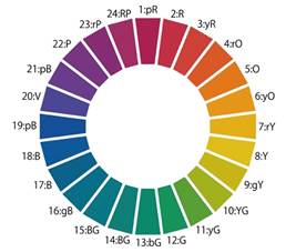 Figure 1. Color circle (left) and shade groups (right) of the PCCS system Figure 1. Color circle (left) and shade groups (right) of the PCCS system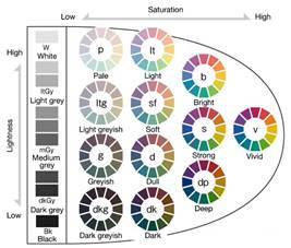
52 shades were included in the experiment palette: 12 tones each from four groups – groups of saturated shades (v), light (lt), dark (dk) and gray (gy) shades. The tone and group of each shade were encoded using traditional PCCS system designations (Table 1). This structure of the toolkit allowed analyzing the data obtained in several directions at once, grouping shades by tone (location on the color wheel), lightness (vertical axis) and saturation (horizontal axis) (Fig. 1 on the right). Table 1Symbols of shades Designations of groups of shades | | | Tone designations | | v b lt dk gy
| vivid bright light dark gray | saturated bright light dark gray (achromatic) | | 2:R 4:rO 6:yO 8:Y 10:YG 12:G
14:BG 16:gB 18:B 20:V 22:P 24:RP | red reddish-orange yellowish-orange yellow yellow-green green blue-green greenish-blue blue violet purple red-purple |
red red-orange yellow-orange yellow yellow-green green blue-green green-blue blue purple violet red-purple | | | | | | | | |
To create pairs of colors, all shades were divided into 7 clusters (see subsp.: [14; 15]). Four clusters contained shades of only one specific chromatic group and achromatic colors; three more clusters included shades of all groups together: Cluster 1 (N=16): 12 saturated shades (v) and 4 achromatic colors (gy). Cluster 2 (N=16): 12 light shades (lt) and 4 achromatic colors (gy). Cluster 3 (N=16): 12 bright shades (b) and 4 achromatic colors (gy). Cluster 4 (N=16): 12 dark shades (dk) and 4 achromatic colors (gy). Cluster 5 (N=16): 4 tones (2, 8, 12 and 18) from groups of light (lt), saturated (v), dark (dk) and 4 achromatic (gy) shades. Cluster 6 (N=16): 4 tones (2, 8, 12 and 18) each from groups of light (lt), bright (b), saturated (v) and 4 achromatic (gy) shades. Cluster 7 (N=8): a group of the most frequently selected colors based on the results of the previous experiment (lt8, b6, b8, v2, v4, v6, v8, gy 9.5) (Sato). 46 pairs of color stimuli were made up of the shades of all groups, each of which was presented to the participant once during the experiment. Experimental designThe experimental tools were developed and tested in 2015-2016 in Japan (N=48) [17]. At the first stage, the participants' color vision was checked using the Ishihara test. At the second stage, the participants had to choose 46 times on the smartphone screen one of the two colors they wanted to touch and click on it. Thus, there were 2208 data in the database (46 decisions of 48 participants). Data analysisDuring the analysis , the following were evaluated: (1) frequency of occurrence of individual shades; (2) groups of shades; (3) shades of a certain tone; (4) the probability of choosing a certain shade out of two. The frequency of occurrence was assessed using procedures and methods of visual statistics. To assess the probability of choosing a certain shade from two, the method of searching for associative rules was used – a data mining procedure that allows you to find patterns between related events in databases (see appendix: [20]). To implement the search for associative rules in the Python programming language using the apyori library, a computer program was written that searches for data using the Apriori algorithm. This algorithm is based on the concept of a frequent set. At each stage, the algorithm scans the database, creates a set of candidates and calculates their support – estimates how often a candidate is found in the database. Next, the algorithm cuts off those candidates whose support is less than the minimum. The remaining sets are called frequently occurring. ResultsShade rating The analysis of color choices for all groups of color stimuli together made it possible to compile a popularity rating of individual shades. The most popular were bright green (b12), saturated yellow (v8), bright green-blue (b16) and achromatic black (gy1.5) and white (gy9.5). The rating of the 10 most frequently chosen shades also includes two blue colors (lt 18 and v18), dark red (dk2), moderate gray (gy7.5) and saturated yellow-orange (v6) (fig. 2). | 
| 
| 
| 
| 
| 
| 
| 
|

| 
| | b12 | v8 | b16 | gy1.5 | gy9.5 | lt18 | v18 | dk2 | gy7.5 | v6 | Figure 2. Rating (from left to right) of the most popular shadesThe lists of frequently chosen shades had pronounced gender differences (Fig. 3). In men and women, they were only half the same. Women were much more likely to choose red shades (dark red dk2 and pink lt2), lilac (lt22), achromatic dark gray (gy2.5) and black (gy1.5). On the contrary, men preferred achromatic white (gy9.5) and light gray (gy7.5), which were not included in the rating of the 10 most popular shades among women at all; they more often chose saturated yellow (v8), yellow-orange (v6) and blue (v18), bright red-orange (b4) and green-blue (b16). 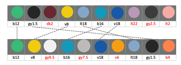
Figure 3. 10 most popular shades for women (top) and men (bottom); matching shades are connected by lines; codes of shades that were included in one list, but did not get into the second, are highlighted in redGroups of shades A comparative analysis of the frequency of shades from different groups showed that participants were slightly more likely to choose saturated (v) shades than bright (b), dark (dk) and light (lt). Achromatic greys (gy) were the most unpopular. We did not find any pronounced gender differences (r = 0.90 p = 0.0347) (Fig. 4). 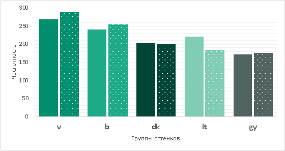
Figure 4. Frequency of selection of shades from different groups in women (solid fill) and men (patterned fill); shades are arranged in descending order of frequency of occurrence in the whole sampleTone shades The most popular were unmixed with other colors blue (18:B) and green (12:G) shades, the most unpopular – mixed yellow-green (10:YG) and purple (blue-purple) (20:V). Women were much more likely than men to choose red (2:R) and red-purple shades (24:RP). On the contrary, among the shades chosen by men, there were more yellow (8:Y), yellow-orange (6:yO) and red-orange (4:rO). In addition to yellow shades, men more often chose green (12:G), blue-green (14:BG) and green-blue (16:gB) tones (Fig. 5). 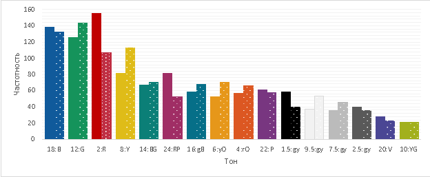
Figure 5. Frequency of selection of shades of different tones in women (solid fill) and men (patterned fill); shades are arranged in descending order of frequency of occurrence in the whole sampleThe probability of choosing one of two shades in a pair At the next stage, we applied the method of searching for associative rules to each of the seven clusters of stimuli. This method allowed us to estimate the probability with which a person will choose one of the two shades in a pair. In this case, we used tone as criteria (in the code of experimental stimuli, tone was indicated by a number), brightness and saturation of shades (in the study, these characteristics were set by letters – b, v, dk, lt, gy). The application of the Apriori algorithm showed that, choosing one shade out of two, men and women in many cases use the same strategies. So, from a combination of achromatic (gy) and chromatic shade from group b (bright shades), both men and women are almost equally likely to choose a bright shade (b) (probability 18.84% and 14.84%, respectively) (rows 3 and 7 of Table 2). On the contrary, from a combination of achromatic (gy) and chromatic shade from the dk group (dark shades), they are more likely to choose achromatic, and women are much more likely than men (probability 10.16% and 4.62%, respectively) (rows 6 and 13 of Table 2). In a combination of achromatic (gy) and chromatic shade from group v (saturated shades), the probability of choosing one or the other shade is almost the same for both men and women (21.88% for women, 7.88% and 7.34% for men) (lines 1-2 and 11-12 of Table 2).
Table 2The results of the algorithm A priori: the probability of choosing a shade from a certain group of brightness and saturation Women | The probability of choosing the shade of the gy group from the v-gy pair is 21.88% The probability of choosing a shade of group v from a pair of v-gy is 21.88% The probability of choosing a shade of group b from a pair of b-gy is 14.84% The probability of choosing the shade of the dk group from the dk-gy pair is 14.84% The probability of choosing the shade of the gy group from the b-gy pair is 10.16% The probability of choosing the shade of the gy group from the dk-gy pair is 10.16% | (1) (2) (3) (4) (5) (6) | | MenThe probability of choosing a shade of group b from a pair of b-gy is 18.84% The probability of choosing the shade of the lt group from the lt-v pair is 13.41% The probability of choosing a shade of group v from a pair of v-b is 12.77% The probability of choosing the shade of the dk group from the dk-v pair is 11.59% The probability of choosing a shade of group v from a pair of v-gy is 7.88% The probability of choosing the shade of the gy group from the v-gy pair is 7.34% The probability of choosing the shade of the gy group from the dk-gy pair is 4.62% | (7) (8) (9) (10) (11) (12) (13) | In terms of tone, the choice strategies have a pronounced gender specificity. So, according to the results of the Apriori algorithm, unlike men, in a combination of achromatic (0) and red (2), red-purple (24) or green-blue shade (16), women are much more likely to choose the chromatic option – red (probability 17.97% and 7.03%, respectively), red-purple (probability 8.07%) or green-blue (probability 7.81%). On the contrary, in combination of an achromatic shade (0) with yellow (8), they are more likely (4.69%) to prefer an achromatic shade (Table 3).
Table 3The results of the algorithm A priori: the probability of choosing a shade of a certain tone; all achromatic shades are indicated by the digit 0 Women | The probability of choosing a shade with a tone of 2 from a pair of 2-0 is 17.97% The probability of choosing a shade with a tone of 24 from a pair of 24-0 is 8.07% The probability of choosing a shade with a tone of 0 from a pair of 6-0 is 8.07% The probability of choosing a shade with a tone of 16 from a pair of 16-0 is 7.81% The probability of choosing a shade with a tone of 0 from a pair of 2-0 is 7.03% The probability of choosing a shade with a tone of 0 from a pair of 8-0 is 4.69% | (1) (2) (3) (4) (5) (6) | | MenThe probability of choosing a shade with a tone of 0 from a pair of 2-0 is 12.76% The probability of choosing a shade with a tone of 2 from a pair of 2-0 is 12.24% The probability of choosing a shade with a tone of 24 from a pair of 24-0 is 6.77% The probability of choosing a shade with a tone of 0 from a pair of 6-0 is 6.25% The probability of choosing a shade with a tone of 6 from a pair of 6-0 is 6.25% The probability of choosing a shade with a tone of 0 from a pair of 24-0 is 5.73% | (8) (9) (10) (11) (12) (13) | ConclusionsThe analysis shows that the various chromatic characteristics of the buttons that a person sees on the touch screen (their tone, lightness and saturation) have a noticeable effect on the motivation to touch them. Firstly, the most powerful triggers of touch are shades with high saturation of the four pure tones to which the optic nerve reacts – bright blue and yellow, green and red colors.
Secondly, both the rating of the most popular shades and the strategies for choosing one shade from a pair have pronounced gender differences. Women are more motivated by red and red-purple shades, men – yellow, orange, green and green-blue. Thirdly, the strategy of choosing one shade out of two in a pair is more predictable for women than for men. In a combination of achromatic and red, red-purple or green-blue shades, women are much more likely to choose the chromatic option. On the contrary, in a combination of an achromatic shade with yellow, they will prefer an achromatic one. The results of the experiment confirm the conclusions obtained earlier that colors associated with tactile sensations do not coincide with the boundaries of lexical categories of color; these associations are not lexical in nature and are not derived from lexical meanings fixed in the language [21; 22]. This, in particular, is indicated by the "blurred" silhouette of the dominant color triggers on the color wheel. We do not exclude that, as in experiments with real objects [12-15], the motivation to touch the touch button on the smartphone screen may be closely related to the emotions caused by color, and the strongest triggers are those colors that arouse interest and sympathy (cf.: [23; 24]). However, this assumption needs additional empirical verification. The data obtained have a wide application potential. They can be used in the design of websites and web applications for users with different socio-demographic characteristics, in the design of interactive educational materials, in the development of the color environment of training and training programs. In order to form final conclusions, the study should be continued on a larger sample, primarily in relation to possible age characteristics and cross–cultural specifics.
References
1. Penetration rate of smartphones in selected countries (2022). Statista. URL: https://www.statista.com/statistics/330695/number-of-smartphone-users-worldwide/
2. Melumad, Sh., Tuan Pham, M. (2020). The Smartphone as a pacifying technology, Journal of Consumer Research, 47(2), https://doi.org/10.1093/jcr/ucaa005
3. Spence, C. (2022). Exploring group differences in the crossmodal correspondences. Multisensory research, 35(6), 495–536. https://doi.org/10.1163/22134808-bja10079
4. Griber, Y. A., Elkind, G. V. (2022). Influence of color on taste perception in people with autism spectrum disorders. Psychology and Psychotechniques, 4, 32–43. https://doi.org/10.7256/2454-0722.2022.4.39295 (in Russ.)
5. Slobodenyuk, N., Jraissati, Y., Kanso, A., Ghanem, L., Elhajj, I. (2015). Cross-modal associations between color and haptics. Attention, Perception, & Psychophysics, 77, 1379–1395. https://doi.org/10.3758/s13414-015-0837-1
6. Lin A., Scheller M., Feng F., Proulx M. J., Metatla O. (2021). Feeling colours: crossmodal correspondences between tangible 3D objects, colours and emotions. In Proceedings of Conference on Human Factors in Computing Systems (pp. 1–12). New York: ACM. https://doi.org/10.1145/3411764.3445373
7. Griber, Y. A. (2022). Color from within: A new vector in the studies of urban coloristics. Project Baikal, 19(71), 144–149. https://doi.org/10.51461/projectbaikal.71.1956 (in Russ.)
8. Griber, Y. A. (2021). A livable colour. Project Baikal, 18(67), 82–87. https://doi.org/10.51461/projectbaikal.67.1759 (in Russ.)
9. Luangrath, A. W., Peck, J., Hedgcock, W., Xu, Y. (2022). Observing product touch: the vicarious haptic effect in digital marketing and virtual reality. Journal of Marketing Research, 59(2), 306–326. https://doi.org/10.1177/00222437211059540
10. Peck, J., Childers, T. L. (2003). Individual differences in haptic information processing: the “need for touch” scale. Journal of Consumer Research, 30, 430–442. https://doi.org/10.1086/378619
11. Peck, J., Wiggins, J. (2006). It just feels good: customers’ affective response to touch and its influence on persuasion. Journal of Marketing, 70(4), 56–69. https://doi.org/10.1509/jmkg.70.4.056
12. Lin, C.‐L. (2018). The effect of object form and tactile enticement material on the motivation of haptic. International Journal of Liberal Arts and Social Science, 6, 8–16. URL: https://ijlass.org/data/frontImages/articles/2.8-16.pdf
13. Chen, R., Tsai, M.-C., Tsay, Y.-S. (2022). Effect of color temperature and illuminance on psychology, physiology, and productivity: an experimental study. Energies, 15, 4477. https://doi.org/10.3390/en15124477
14. Lin, C.‐L., Chen, S.‐J. (2018). The influence of product presentation mode and academic major on the motivation of haptic. Humanities & Social Sciences Review, 6, 21–26. https://doi.org/10.18510/hssr.2018.623
15. Goldsmith, M., Reiter, M. (2022). Triggers: Creating behavior that lasts – becoming the person you want to be. Moscow: Bombora, pp. 1–272.
16. Lin, C.-L. (2020). The influence of color temperature and illuminance on the touch motivation and preference of craft. Journal of Ambient Intelligence and Humanixed Computing. https://doi.org/10.1007/s12652-020-02529-3
17. Mizutani, Y., Kitaguchi, S., Sato, T. (2016). Colour influence on user’s motivation to press input button: analysis using paired comparison. In Proceedings of the International Colour Association (AIC) Conference 2016 (pp. 177–180). Chile: International Colour Association, 2021. URL: https://www.aic-color.org/resources/Documents/AIC2016-Book-of-Proceedings.pdf
18. Nishiyama, D., Jung, H., Kitaguchi, S., Sato, T. (2013). Colour influence on user’s motivation to press an input button. In Proceedings of the International Colour Association (AIC) Conference 2013, vol. (pp. 1217–1220). Newcastle: International Colour Association. URL: https://www.aic-color.org/resources/Documents/aic2013proc3.pdf
19. Narkevich, A. N., Vinogradov, K. A. (2019). Methods for determining the minimum required sample size in medical research. Social aspects of population health, 65(6), 10. URL: http://vestnik.mednet.ru/content/view/1123/30/lang,ru/ (in Rus).
20. Samoylova, Ň. Ŕ., Griber, Y. A. (2020). Intelligent analysis of color preferences: search for associative rules vs. cluster analysis. World of Science. Pedagogy and Psychology, 6. URL: https://mir-nauki.com/PDF/107PSMN620.pdf (in Russ.)
21. Wright, O., Jraissati, Y., Özçelik, D. (2017). Cross-modal associations between color and touch: mapping haptic and tactile terms to the surface of the Munsell color solid. Multisensory Research, 30, 7–8, 691–715. https://doi.org/10.1163/22134808-00002589
22. Jraissati, Y., Slobodenyuk, N., Kanso A., Ghanem, L., Elhajj, I. (2016). Haptic and tactile adjectives are consistently mapped onto color space. Multisensory research 29, 1–3, 253–278. https://doi.org/10.1163/22134808-00002512
23. Griber, Y. A., Jonauskaite, D., Mohr, C. (2019). Colors of emotion: an experimental study of associative relationships in contemporary Russian. Litera, 1, 69–86. https://doi.org/10.25136/2409-8698.2019.1.28892 (in Russ.)
24. Jonauskaite, D., Abu-Akel, A., Dael, N., Oberfeld, D., Abdel-Khalek, A. M., Al-Rasheed, A. S., Antonietti, J.-P., Bogushevskaya, V., Chamseddine, A., Chkonia, E., Corona, V., Fonseca-Pedrero, E., Griber, Y. A., Grimshaw, G., Hasan, A. A., Havelka, J., Hirnstein, M., Karlsson, B. S. A., Laurent, E., … Mohr, C. (2020). Universal Patterns in Color-Emotion Associations are further shaped by linguistic and geographic proximity. Psychological Science, 31(10), 1245–1260. https://doi.org/10.1177/0956797620948810
First Peer Review
Peer reviewers' evaluations remain confidential and are not disclosed to the public. Only external reviews, authorized for publication by the article's author(s), are made public. Typically, these final reviews are conducted after the manuscript's revision. Adhering to our double-blind review policy, the reviewer's identity is kept confidential.
The list of publisher reviewers can be found here.
Review of the article "Color as a trigger: the effect of chromatic characteristics of touch buttons on touch motivation" The subject of the study is stated by the author of the article directly - the effect of chromatic characteristics of touch buttons on touch motivation. The research methodology is based on traditional methods of psychological research. The literature analysis is somewhat poorly applied in the first part. The author only records the relevance of the stated topic, without reference to supporting data. It is also important to describe the terminology of the study. For example, what is meant by the term "trigger", given its ambiguity. The empirical part of the study is presented quite extensively. It is based on testing the hypothesis that the various chromatic characteristics of buttons that a person sees on a touchscreen (their brightness, tone, saturation) can act as independent visual triggers and have a noticeable effect on the desire to touch them. The author analyzes the peculiarities of perception and the influence of touch buttons on the motivation of touch in the subjects in the number of 48 people with normal color vision (24 men and 24 women) aged 19 to 21 years. But the author does not specify which criteria were used in the selection of the subjects. The article is left out – why exactly did such people participate in the experimental work? The selection criteria for the formation of a representative sample are especially important, since the sample is not sufficiently extensive in terms of the number of subjects. Given that the object of the study is stated to be "modern smartphone users", it is important to clarify the selection criteria, and it is possible to increase the sample size. The study uses Color stimuli that were developed based on the PCCS system (Japanese Institute of Color, developed in 1964). The analysis of average values and cluster analysis are used as mathematical research methods. The relevance of the presented article is beyond doubt. The interest in studying the motivation for using smartphones and their impact on people's lives is increasing exponentially. And due to the growing Internet addiction, the stated topic is growing every year from both a scientific and an applied point of view. Unfortunately, the author did not confirm the relevance of the topic with statistical data, a review of applied research, and a request for practice. This remark has a special status, since the study is interdisciplinary in nature – it concerns various scientific fields (psychology, marketing, physics, etc.). The scientific novelty of the study is associated with the use of color stimuli techniques to analyze user preferences and motivation when using a smartphone. Style, structure, content The article has a traditional structure – introductory, main and final parts. The introductory part justifies the choice of the topic. The author gives examples of research and generalizes the conclusions that formed the basis of the theoretical part of the work. The main part of the article provides a detailed description of the organization of the study – the participants of the experiment, the incentives of the experiment, the design of the study. The effective part of the work is described in sufficient detail: the rating of shades, their groups, tones of shades. The results of the algorithms are presented in summary tables. In conclusion, the author draws very qualitative conclusions. And offers to use the wide application potential of the data obtained. The style of presentation of the material meets the requirements of science, but at the same time it is quite accessible to perception. The work is accompanied by informative drawings, tables, and graphs. The bibliography includes 20 sources, mainly periodicals. The bulk of them are in English, which is quite natural, given the specificity of the declared topic and its development abroad. The list of references is designed in accordance with the rules. In the list of references, it is recommended to study the materials of fundamental research, monographs on color perception, including the work of domestic psychologists. Appeal to opponents – the article can be recommended for publication after correcting the comments. It is recommended to: ? describe the terminology in detail (for example, what is also a "trigger" and how the term is further used in the article, except for the name), ? characterize the criteria for selecting subjects and justify the reason for the small sample size, since traditionally in psychophysiological research the sample should be wider. to describe the further direction of the study, taking into account its prospects. Is it possible to consider this study as a pilot? Conclusions, the interest of the readership – after correction, the article will arouse the interest of the readership – psychologists, psychodiagnostics, researchers, psychology teachers, marketers, etc.
Second Peer Review
Peer reviewers' evaluations remain confidential and are not disclosed to the public. Only external reviews, authorized for publication by the article's author(s), are made public. Typically, these final reviews are conducted after the manuscript's revision. Adhering to our double-blind review policy, the reviewer's identity is kept confidential.
The list of publisher reviewers can be found here.
The paper "Color as a trigger: the influence of chromatic characteristics of touch buttons on touch motivation" is submitted for review. The subject of the study. The object of the study is modern smartphone users, and the subject is the influence of chromatic characteristics of touch buttons on touch motivation. It should be noted that the designated item has been fully disclosed. At the same time, the formulation of the object is incorrect, since the object of scientific psychological research cannot be the user, but only the state, process, pattern, etc. At the same time, the subject is formulated correctly. Research methodology. The research methodology is traceable. The author set out to experimentally test the hypothesis that various chromatic characteristics of buttons that a person sees on a touchscreen (their brightness, tone, saturation) can act as independent stimuli of behavioral reactions (visual triggers) and have a noticeable effect on the desire to touch them. Relevance. The relevance of the research is indicated in the work, representing the study of the influence of the color used on human motivation. The author clearly outlined the criteria for studying. Scientific novelty. The study showed that the various chromatic characteristics of the buttons that a person sees on a touchscreen (their tone, lightness and saturation) have a noticeable effect on the motivation to touch them. Firstly, the most powerful triggers of touch are shades with high saturation of the four pure tones to which the optic nerve reacts - bright blues and yellows, greens and reds. Secondly, there are pronounced gender differences. Women are more motivated by red and red-purple shades, men are more motivated by yellow, orange, green and green-blue. Thirdly, the strategy of choosing one shade out of two in a pair is more predictable for women than for men. In a combination of achromatic and red, red-purple or green-blue shades, women are much more likely to choose the chromatic option. On the contrary, in combination of an achromatic shade with yellow, they will prefer an achromatic one. The results of the study are interesting and there is a prospect for further research. Style, structure, content. The style of presentation corresponds to publications of this level. The language of the work is scientific. The structure of the work is clearly visible. The introduction presents: a description of the relevance of the work, a small theoretical overview. The next section is a method that includes a description of the sample, the stimuli of the experiment, the features of the experimental design, and the analysis of the data obtained. The third section includes a description of the results – the rating of shades, groups of shades, tones of shades, the probability of choosing one of the two shades in a pair. The work ends with reasoned conclusions. The results of the work are presented, among other things, in graphic form – in the form of graphs and drawings. Bibliography. The bibliography of the article includes 24 domestic and foreign sources, most of which have been published in the last three years. The list includes research articles and monographs. The sources of information are designed correctly, in accordance with the requirements. Appeal to opponents. The author needed to pay more attention to the theoretical review of modern research. Conclusions. The article is distinguished by its undoubted relevance, theoretical and practical value, and will be of interest to the scientific community. The work may be recommended for publication.
|

 Eng
Eng


